I thought starting out a serious blog regarding media and publishing issues would be boring, especially since we had to scour through many readings and link these issues to the theories in them. The issues posed in today's publishing world are interesting and engaging, I was surprised to find delight in in discussing them.
This blog made me realise the importance of upholding credibility when presenting information online. Believe me; it is disheartening to find an article you are interested in then ponder whether you should trust it.
I have finally clearly understood elements in document design and layout by applying these theories to practice through this blog. My understanding of typographic devices and multimodality has never been better. Overall, this has been a wonderful learning experience for me.
Sunday, November 9, 2008
Saturday, November 8, 2008
Accio Lawyers~!

"Accio" is a summoning spell used in the worldwide craze, the Harry Potter series. Since the launch of the first book, 'Harry Potter and the Philosopher's Stone', this franchise owned by J.K. Rowling, the book's author, has churned out six other books, movies and many other merchandise. For something as huge as the book series, fansites are sure to emerge everywhere on the Internet. One fansite went a little too far.
Harry Potter Lexicon is a Potter encyclopaedia run by Steven Vander Ark. When he decided to publish all the information he compiled about the 'Potter-verse', Rowling summoned her lawyers and sued him, claiming copyright infringement.
Reep (2006, p.41) defines copyright as "the legal protection for the creators of original works". An infringement of copyright occurs when someone uses the original works of a creator for their own interest and benefit without getting his/her permission first. In a way, copyright infringement is similar to plagiarism except copyrights are usually bounded by the law.
Although I would be excited to own a copy of a Potter encyclopaedia myself, I do not intend to buy one that basically steals all the information from Ms Rowling. This matter is simply unethical. Luckily, CBS News reports that the judge ruled in favour of Rowling, stating that it would "cause her irreparable harm as a writer".
I have heard of some people who are against the judge's ruling, saying Rowling should let someone else have a go at making billions of dollars. I say, even though she is one of the richest people in the world, she still has the right to keep what is hers and that should be the end of it.
References:
CBS News 2008, "Harry Potter" Author Wins Copyright Claim, 8 September, viewed 8 November 2008, [http://www.cbsnews.com/stories/2008/09/08/entertainment/main4426302.shtml].
Reep, DC 2006, Technical Writing: Principles, Strategies, and Readings, 6th edn, Pearson Education, USA.
Friday, November 7, 2008
Not everyone sees :-) the same way as you
Twenty five years ago, Scott Fahlman thought it would only be appropriate to include a sideways smiley face made up of a colon, a hyphen and a parenthesis (The Media Report 2007). The rest is history.
Since then, there have been hundreds and maybe thousands of new emoticons used in emails, text messages, and especially instant messaging services, with its usage gaining popularity in the last 10 years.
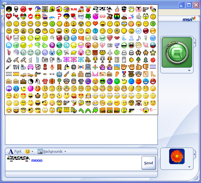 Sample of the many emoticons available for instant messaging use.
(Source: Sherv.net)
Since then, there have been hundreds and maybe thousands of new emoticons used in emails, text messages, and especially instant messaging services, with its usage gaining popularity in the last 10 years.
Sample of the many emoticons available for instant messaging use.(Source: Sherv.net)
Most people assume that everyone who has a computer would know how to interpret emoticons but there are differences in interpreting emoticons. In an Ars Technica article (Timmer 2007), studies show that facial expressions can be interpreted accurately by all human cultures but when interpreting emoticons, there are slight differences.
 Typical 'Japanese' emoticons
(Source: Manga Candy)
A common problem emoticon users suffer from is excessive usage of emoticons in instant messaging. The picture below is an example of what I am talking about.
I can identify that the conversation is about inviting someone to a party but I do not think the emoticons used helped me understand the chatters' feelings. Schirato and Yell (1996) defines intertextuality as the process of comprehending texts in reference to their relations with other texts. They mention that all texts carry elements, or traces, of context with them. I tried to relate this theory in understanding the above text , I failed.
Emoticons were thought to help users express themselves better but over-excessive and improper use can confuse people.Next time you say to hi to someone on MSN, do not greet them with multi-coloured texts and pictures of fat, yellow smilies waving towards the screen.
References:
Kress, G & van Leeuwen 1998, 'Front Pages: (the critical) analysis of newspaper layout' in Approaches to Media Discourse, Blackwell, Oxford, pp. 186-219.
Schirato, T and Yell, S 1996, ‘Chapter 5: Framing contexts’ in Communication and cultural literacy: An introduction, Allen and Unwin, New South Wales.
The Media Report 2007, 'Emoticons and email etiquette', audio recording, ABC Radio National, 18 October, viewed 7 Novemober 2008, [http://www.abc.net.au/rn/mediareport/stories/2007/2064342.htm].
Timmer, J 2007, 'Emotions carry cultural baggage' in Ars Technica, viewed 7 November 2008, [http://arstechnica.com/news.ars/post/20070514-emoticons-carry-cultural-baggage.html].
Typical 'Japanese' emoticons(Source: Manga Candy)
In his article, Timmer (2007) compares the smiley uses in Japan and USA. In Japanese culture, subdued emotional expressions are considered polite and emphasis is put on the eyes rather than the mouth. In America, people are not shy in expressing themselves so they concentrate on mouths when expressing. Basically, the Japanese prefer ^-^ while the Americans prefer :D.
Kress and van Leeuwen (1998) states that certain cultures provide training for reading and viewing. Above is an example of Japanese emoticons. They are called that because those symbols are often used to express 'Anime' characters. Someone who has not been exposed to 'Anime' would not know what these symbols mean.
Kress and van Leeuwen (1998) states that certain cultures provide training for reading and viewing. Above is an example of Japanese emoticons. They are called that because those symbols are often used to express 'Anime' characters. Someone who has not been exposed to 'Anime' would not know what these symbols mean.
A common problem emoticon users suffer from is excessive usage of emoticons in instant messaging. The picture below is an example of what I am talking about.

Emoticons were thought to help users express themselves better but over-excessive and improper use can confuse people.Next time you say to hi to someone on MSN, do not greet them with multi-coloured texts and pictures of fat, yellow smilies waving towards the screen.
References:
Kress, G & van Leeuwen 1998, 'Front Pages: (the critical) analysis of newspaper layout' in Approaches to Media Discourse, Blackwell, Oxford, pp. 186-219.
Schirato, T and Yell, S 1996, ‘Chapter 5: Framing contexts’ in Communication and cultural literacy: An introduction, Allen and Unwin, New South Wales.
The Media Report 2007, 'Emoticons and email etiquette', audio recording, ABC Radio National, 18 October, viewed 7 Novemober 2008, [http://www.abc.net.au/rn/mediareport/stories/2007/2064342.htm].
Timmer, J 2007, 'Emotions carry cultural baggage' in Ars Technica, viewed 7 November 2008, [http://arstechnica.com/news.ars/post/20070514-emoticons-carry-cultural-baggage.html].
Thursday, November 6, 2008
"A change will do you good"
Not too long ago, social networking giant, Facebook, launched a new look for the popular website (Australian IT 2008). While changes are often embraced, most of Facebook's 100 million users were unhappy.

 The 'old' Facebook layout (top) and the 'new' Facebook layout (bottom)
I should first clarify that I am not a Facebook user and I can hear your gasps in disbelief. However, based on my observations of being surrounded with many Facebook users, I think the new layout is much better.
I remembered glancing at Facebook when it first gained popularity amongst my family and friends, I was so confused. I found the layout to be messy and a bit disorganised.
Walsh (2006) notes that information on websites are fragmented into frame sections so it is easily segmented. Mackenzie (cited in Putnis & Petelin 1996) explains that typographic designs reflect and develop meaning of words by creating paths through texts for readers but as Walsh (2006) points out, Internet users tend to choose their own reading pathways based on their interest. The new layout, with its segmented information using appropriate headings and subheadings, allows this to be achieved with ease.
The new layout meets the basic design principles set out by Reep (2003). It has achieved balance, proportion and sequence by expanding the pages' width which allows for more important information to be presented at the top in one look. This allows for maximum utility of images throughout the screen to achieve good balance. Consistency was maintained by placing navigation buttons, search bars and other hyperlinks the same way in every page.
People should not be so quick to shun change because they are not used to it. Give it time and as Palihapitiya said, eventually "you will find these changes just as useful as past improvements."
References:
Australian IT 2008, 'Facebook makeover leaves some devotees fuming', Australian 11 September, viewed 6 November 2008, [http://www.australianit.news.com.au/story/0,24897,24328928-15318,00.html].
Putnis, P & Petelin, R 1996, 'Writing to communicate' in Professional communication: principles and applications, Prentice Hall, Sydney.
Reep, DC 2003, ‘Chapter 6: Document design’ in Technical Writing, 6th edn, Pearson Longman, New York.
Walsh, M 2006, ‘The ‘textual shift’: Examining the reading process with print, visual and multimodal texts’, Australian Journal of Language and Literacy, vol. 29, no. 1, pp. 24-37.
The new design layout enables members to use tabs to prioritise new pictures, messages and "feeds" on main profile pages. According to Facebook vice president of marketing, Chamath Palihapitiya, these changes were based on feedback received from members as well as to cater to the trend where people go online and post their pictures, videos and musings instantly (Australian IT 2008).

 The 'old' Facebook layout (top) and the 'new' Facebook layout (bottom)
(Source: HTML Center)
The people at Facebook were careful enough to ensure that their users remain top priority in improving their product. "We want to make sure it is easy for people to push and pull information in the form of bite-size content rather quickly," said Palihapitiya at the unveiling of the redesign (Australian IT 2008). See?
Yet, so many in websites and forums express dissatisfaction over the new layout change. Even a song was written on the change!
Yet, so many in websites and forums express dissatisfaction over the new layout change. Even a song was written on the change!
I should first clarify that I am not a Facebook user and I can hear your gasps in disbelief. However, based on my observations of being surrounded with many Facebook users, I think the new layout is much better.
I remembered glancing at Facebook when it first gained popularity amongst my family and friends, I was so confused. I found the layout to be messy and a bit disorganised.
Walsh (2006) notes that information on websites are fragmented into frame sections so it is easily segmented. Mackenzie (cited in Putnis & Petelin 1996) explains that typographic designs reflect and develop meaning of words by creating paths through texts for readers but as Walsh (2006) points out, Internet users tend to choose their own reading pathways based on their interest. The new layout, with its segmented information using appropriate headings and subheadings, allows this to be achieved with ease.
The new layout meets the basic design principles set out by Reep (2003). It has achieved balance, proportion and sequence by expanding the pages' width which allows for more important information to be presented at the top in one look. This allows for maximum utility of images throughout the screen to achieve good balance. Consistency was maintained by placing navigation buttons, search bars and other hyperlinks the same way in every page.
People should not be so quick to shun change because they are not used to it. Give it time and as Palihapitiya said, eventually "you will find these changes just as useful as past improvements."
References:
Australian IT 2008, 'Facebook makeover leaves some devotees fuming', Australian 11 September, viewed 6 November 2008, [http://www.australianit.news.com.au/story/0,24897,24328928-15318,00.html].
Putnis, P & Petelin, R 1996, 'Writing to communicate' in Professional communication: principles and applications, Prentice Hall, Sydney.
Reep, DC 2003, ‘Chapter 6: Document design’ in Technical Writing, 6th edn, Pearson Longman, New York.
Walsh, M 2006, ‘The ‘textual shift’: Examining the reading process with print, visual and multimodal texts’, Australian Journal of Language and Literacy, vol. 29, no. 1, pp. 24-37.
Wednesday, November 5, 2008
Is a picture really worth a thousand words?
Literally, of course not. If pictures were sold according to how many words a person can write about it, no one would buy pictures. We often hear people uttering this popular phrase but there are still those who underestimate the true power of the photograph. My question for those who doubt a pictures worthiness is simply "why?"
Pictures can stimulate the reader's interest and curiosity in a topic (Nickerson in Schriver 1997). People also tend to remember pictures better than words (Shepard in Schriver 1997). Swedish research on broadcast news shows that although the audience prefers as much "live footage" as possible, still photographs can impact the audience just the same (Findahl et. al in Schriver 1997).
In The Power of the photograph, Sonja Heizman reports of a gallery dedicated to war photography in Dubrovnik. Those who witnessed the photographs in the gallery were clearly moved by the effects of war.

A child crying for his mother following the American bombardment of Inchon, Korea.
(Source: Flickr)
Photographs used to accompany other texts as pictures can overwhelm the prose presented, shifting the attention to the picture (Schriver 1997). Now, some rather let the pictures tell the story (Kress and van Leeuwen 2006).
In the media report (2007), Wade Goddard, the war gallery owner, claims to trust photographers more as the pictures they captured exemplified the situation of war rather than journalists, who through their editors, write stories at an angle and might have a bias towards the news story.
Goddard should not be quick to trust people. In 2007, a Reuters photographer stirred controversy by altering photographs he had taken to publish through Reuters. He had used Adobe Photoshop to digitally alter elements in his photos to worsen the appearance of a situation.

A before (left) and after (right) comparison of a photo taken by former Reuters photographer, Adnan Hajj.
(Source: Wikipedia)
Images are truly powerful. Its ability to influence and alter perceptions is tremendous. Imagine if more digitally altered pictures were published; it would distort the reality that photographs are known to represent. The Lebanon war would have been represented as a far worse situation than it is. Ultimately, this matter is simply unethical.
References:
Kress, G & van Leeuwen, TV 2006, ‘The semiotic landscape’ in Reading images: The grammar of visual design, 2nd edn, Routledge, London.
Schriver, KA 1997, ‘Chapter 6: The interplay of words and pictures’ in Dynamics in document design: Creating texts for readers, Willy Computer Publishing, New York.
The Media Report 2007, ‘The power of the photograph’, audio recording, ABC Radio National, 4 October, viewed 5 November 2008, [http://www.abc.net.au/rn/mediareport/index/date2007.htm].
Tuesday, November 4, 2008
The increasingly Common Phenomenon
Blogs...
...or weblogs, have come a long way since first coined by Jorn Barger in 1997 on his website Robot Wisdom (Blood 2000). They are usually written by an individual and made accessible online.
This term is now used to describe “frequently updated observations, news, headlines, commentary, recommended links or diary entries, generally chronologically organized” (Werbach 2001). Blogs are so popular that they are reportedly mushrooming with a new blog every second (Ramos & Piper 2006)!
This 'mushroom' trend...
...has evolved from publishing personal thoughts (lyk, OMG!1!! 2daY Wuz s000ooo aWeSOme!) to tackling serious matters like racial discrimination . Since 2002, there have been 133 million blogs recorded (Technorati 2008).
People know blogs are powerful and important. Professional blogs attract roughly 44,000 unique visitors monthly (Technorati, 2008).
The great thing about blogs are its simplicity. It is easy to set up and you can publish your post as soon as you are happy with it.
According to Reporters without Borders, blogs are some countries' only source for independent news as the mainstream media is too tightly controlled (Ramos & Piper 2006).
A growing movement in the blogging community is the emergence of blog shops, where people sell various items through them. Besides that, online advertising on blogs where the blog owner gets paid for allowing advertisements is increasingly popular.
Wait... there are how many types of blog?!
Blogs can be academic and non-academic. It can discuss various subjects like (Wikipedia 2008):
Wikipedia (2008) lists three common blog types:
Blogging communities are inevitably formed through the use of comment boxes, tagboards, links and many others. The feedback received enables those in the community to expand their fascination of their interest.
.
The Media Report 2008, 'A taxonomy of blogs', audio recording, ABC Radio National, 25 September, viewed 4 November 2008, [http://www.abc.net.au/rn/mediareport/stories/2008/2372882.htm#transcript].
Werbach, K 2001, ‘Mapping the Net: Revenge of the Physical World’ in Release 1.0, viewed 4 November 2008, [http://www.release1-0.com/release1/abstracts.php?Counter=4359811].
White, N 2006, ‘Blogs and Community – launching a new paradigm for online community?’ in The Knowledge Tree, vol.11, viewed 4 November 2008, [http://kt.flexiblelearning.net.au/tkt2006/edition-11-editorial/blogs-and-community-%E2%80%93-launching-a-new-paradigm-for-online-community].
Wikipedia, 2008, 'Types' in Blog, viewed 4 November 2008, [http://en.wikipedia.org/wiki/Blogs#Types].
...or weblogs, have come a long way since first coined by Jorn Barger in 1997 on his website Robot Wisdom (Blood 2000). They are usually written by an individual and made accessible online.
This term is now used to describe “frequently updated observations, news, headlines, commentary, recommended links or diary entries, generally chronologically organized” (Werbach 2001). Blogs are so popular that they are reportedly mushrooming with a new blog every second (Ramos & Piper 2006)!
This 'mushroom' trend...
...has evolved from publishing personal thoughts (lyk, OMG!1!! 2daY Wuz s000ooo aWeSOme!) to tackling serious matters like racial discrimination . Since 2002, there have been 133 million blogs recorded (Technorati 2008).
People know blogs are powerful and important. Professional blogs attract roughly 44,000 unique visitors monthly (Technorati, 2008).
The great thing about blogs are its simplicity. It is easy to set up and you can publish your post as soon as you are happy with it.
According to Reporters without Borders, blogs are some countries' only source for independent news as the mainstream media is too tightly controlled (Ramos & Piper 2006).
A growing movement in the blogging community is the emergence of blog shops, where people sell various items through them. Besides that, online advertising on blogs where the blog owner gets paid for allowing advertisements is increasingly popular.
Wait... there are how many types of blog?!
Blogs can be academic and non-academic. It can discuss various subjects like (Wikipedia 2008):
Wikipedia (2008) lists three common blog types:
- personal blog
- corporate blog
- question blog
Wikipedia (2008) also enlists blogs according to its media type:
Evidently, there are numerous ways to categorise blog types. In The Media Report (2008), Margaret Simons labelled blog types according to the matter and method it is discussed. For instance, exhibition blogs are where craftspeople, artists and writers publish their works of art.
Blogging communities are inevitably formed through the use of comment boxes, tagboards, links and many others. The feedback received enables those in the community to expand their fascination of their interest.
White (2006) names three main community patterns.
- One Blog Centric Community – a community is formed around one blog, even inviting others to commentate on the blog.
- Topic Centric Community – a number of blogs discuss similar topics and are linked and often referred to by each other.
- Boundaried Communities – host sites that later enables its users to discuss in forums and blog about various things.
PerezHilton.com, a celebrity gossip blog, has a Topic Centric Blog Community. The blog editor receives feedback from emails, comments and various responses to the activities he has on his blog. The blog also contains links to other similar blogs and these blogs maintain and promote his blog too.
References:
Blood, R 2000, ‘Weblogs: a history and perspective’ in Rebecca’s Pocket, viewed 4 November 2008, [http://www.rebeccablood.net/essays/weblog_history.html]
Ramos, M & Piper, PS 2006, ‘Letting the grass grow: grassroots information on blogs and wikis’, Reference Services Review, vol. 34, no. 4, pp. 570-574.
The Media Report 2008, 'A taxonomy of blogs', audio recording, ABC Radio National, 25 September, viewed 4 November 2008, [http://www.abc.net.au/rn/mediareport/stories/2008/2372882.htm#transcript]
Werbach, K 2001, ‘Mapping the Net: Revenge of the Physical World’ in Release 1.0, viewed 4 November 2008, [http://www.release1-0.com/release1/abstracts.php?Counter=4359811]
White, N 2006, ‘Blogs and Community – launching a new paradigm for online community?’ in The Knowledge Tree, vol.11, viewed 4 November 2008, [http://kt.flexiblelearning.net.au/tkt2006/edition-11-editorial/blogs-and-community-%E2%80%93-launching-a-new-paradigm-for-online-community]
Wikipedia, 2008, 'Types' in Blog, viewed 4 November 2008, [http://en.wikipedia.org/wiki/Blogs#Types]
Blogging is publishing? Naww~
Print design versus online design
Yes, blogging is publishing. However, not everything about designing documents online and for print are the same. It is important to consider the strengths and weaknesses of either option to achieve optimum readability. Let's compare!
Yes, blogging is publishing. However, not everything about designing documents online and for print are the same. It is important to consider the strengths and weaknesses of either option to achieve optimum readability. Let's compare!

Example of online document.
(Source: Yahoo! Finance)
People read roughly 25% slower online. It is harder to read documents online thus; many people opt to scan the documents instead of reading it verbatim (Nielsen 1996). When scanning, Nielsen (2006) found that most readers follow an F-shaped pattern, resulting in more websites obeying this now-basic rule in online document design.
Online layouts often employ graphic aids to assist readers in grasping the topic quickly. It is also important to have balance of white space between proses so reading paths can be formed without straining their eyes (Reep 2006).

Example of print document.
(Source: The Journal)
While both documents maintains the same principles (white space, balance, margins), there are differences. Both print and online documents practice multimodality, incorporating more than one type of text, but writing remains dominant in print publishing (Kress & van Leeuwen 1998). This is because it is easier to read tangible documents.
Youtube? Wasn't it iPod?
Youtube is arguably one of the most popular websites on the web. It hosts videos posted by millions of users and can be about anything. Youtube, along with moblogs and online newspapers, are some of the newest trends in the publishing industry.
 Youtube's main page.
(Source: Youtube)
Youtube allows for more information to be 'published' online. Its influence on web users is undeniably strong. This is why movie houses and even politicians use Youtube to spread their message to the public.


Screenshots of John McCain and Barack Obama's youtube page.
(Source: Youtube, Youtube)
A good example would be the recent USA presidential elections. Both candidates utilised the website's popularity to secure voters.
Videos are more engaging than text and pictures yet they still need each other to create a balance in presenting information (Reep 2006). Youtube, and other video hosting sites, practices multimodality - just like print and web layouts except these sites place more emphasis on audio and visual texts.
Despite being a revolutionary progress in the publishing world, it still has to maintain basic design features like typographic devices and written cues to help readers find information faster and easier (Reep 2006).
References:
Kress, G & van Leeuwen 1998, ‘Front pages: (the critical) analysis of newspaper layout’ in Approaches to Media Discourse, Blackwell, Oxford, pp. 186-219.
Nielsen, J 1996, In Defense of Print, viewed 12 October 2008, [http://www.useit.com/alertbox/9602.html]
Nielsen, J 2006, F-Shaped Pattern for Reading Web Content, viewed 11 October 2008, [http://www.useit.com/alertbox/reading_pattern.html]
Reep, D 2006, ‘Chapter 6 - Document Design’, Technical Writing, Pearson/Longman, New York, pp. 133-172.
Monday, November 3, 2008
Common Phenomenon: An oxymoron
Welcome to Common Phenomenon! Feel free to browse around.
Purpose
This blog will discuss recent publishing and/or media issues by linking them to concrete theories of scholars.
Audience
The primary audience for this blog are communication students and anyone who wishes to expand their knowledge in understanding publishing and/or media issues.
Purpose
This blog will discuss recent publishing and/or media issues by linking them to concrete theories of scholars.
Audience
The primary audience for this blog are communication students and anyone who wishes to expand their knowledge in understanding publishing and/or media issues.
Subscribe to:
Posts (Atom)